the good parts of float and clear
flexbox and css grid are the new boys in the block but you will never know when you are going to need to know how float and clear work.
float and clear are not difficult once you understand what is happening.
basic understanding
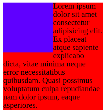
It looks like when you float an element, all other elements that are not floated wrap around the floated element.
The code for the image above.
HTML
<div class="blue"></div>
<div class="red">
    Lorem ipsum dolor sit amet consectetur adipisicing elit. Ex placeat atque sapiente explicabo dicta, vitae minima neque error necessitatibus quibusdam. Quasi possimus voluptatum culpa repudiandae nam dolor ipsum, eaque asperiores.
</div>
CSS
.blue {
  background-color: blue;
  float: left;
  width: 100px;
  height: 100px;
}

.red {
  background-color: red;
  width: 200px;
}
It is a good assumption that everything wraps around floated element but really only text wraps around the floated element and everything else goes underneath it.
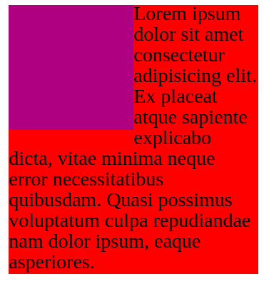
When giving the blue box opacity you can see the red box is underneath the blue one. Only the text is wrapped around the floated element.
Note: using the same code from the previous one just adding a opacity to the blue box.
CSS
.blue {
  background-color: rgba(0, 0, 255, 0.5);
}
You can think of float as a element that is floating in the air and everything but text goes underneath it.
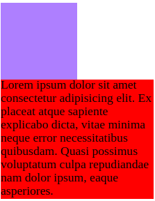
How would we fix it so that the red box doesn’t go underneath the blue box?
The answer is clear.
CSS
When we add clear: both it moves the element out of where the floating elements are.
note: we could use clear: left; or clear: right but its always better to use clear: both;
practical example of float and clear
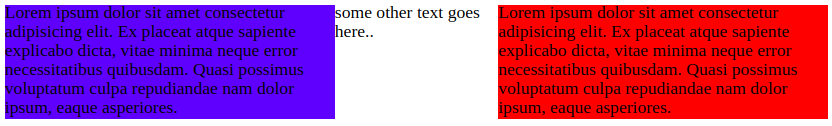
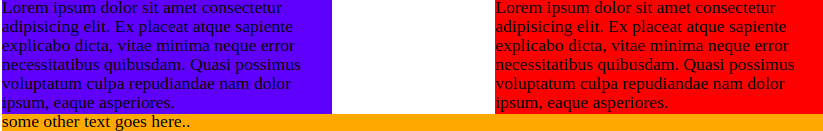
Float will be most likely used when trying to make columns.
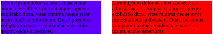
The code for above picture. This is the most common case you will find people using float.
HTML
<div class="blue">
      Lorem ipsum dolor sit amet consectetur adipisicing elit. Ex placeat atque sapiente explicabo dicta, vitae minima neque error necessitatibus quibusdam. Quasi possimus voluptatum culpa repudiandae nam dolor ipsum, eaque asperiores.
</div>

<div class="red">
    Lorem ipsum dolor sit amet consectetur adipisicing elit. Ex placeat atque sapiente explicabo dicta, vitae minima neque error necessitatibus quibusdam. Quasi possimus voluptatum culpa repudiandae nam dolor ipsum, eaque asperiores.
</div>
CSS
div {
  width: 300px;
}

.blue {
  background-color: blue;
  float: left;
}

.red {
  background-color: red;
  float: right;
}
You might be wondering what if we put another element that isn’t floated what will happen?
HTML
<section>
  <p>some other text goes here..</p>
</section>
The section we add just goes in the middle how would we fix this ?
The answer is to use clear
CSS
section {
  /* for visual */
  background-color: orange;
  /* when we add clear: both it moves the element out of where the floating elements are. */
  clear: both;
}
Once we add clear: both it moves the element away from the floating elements.
why you shouldn’t use float and clear
There is no practical reason to use float and clear. use flexbox when trying to achieve the layouts you could get from float and clear.
conclusion
Use flex instead of float and clear because they are outdated. It is important to know how they work because you will see a lot of it in old legacy code.